Custom Popup
This guide will help you create a custom popup that can be used by SIP Core. This popup will interact with the SIP Core instance and provide basic functionality such as answering & ending calls.
For this guide we expect you to have sip-hass-card already installed, configured and running in your Home Assistant instance. If you haven't done that yet, please refer to the Installation Guide to set it up.
Step 1: Create the Popup
Create a new file named sip-example-popup.js in your project directory. This file will contain the code for your standalone popup. Here is a basic example:
Example Popup
This example shows how to create a standalone popup that can be used by SIP Core. It includes basic functionality to interact with the SIP Core instance.
import {
LitElement,
html,
css,
} from "https://cdn.jsdelivr.net/npm/lit-element@4.2.0/+esm";
class SIPExampleDialog extends LitElement {
sipCore;
open = false;
hass = sipCore.hass;
config = sipCore.config.popup_config;
constructor() {
super();
this.setupButton();
// bind openPopup and closePopup to this instance
this.openPopup = this.openPopup.bind(this);
this.closePopup = this.closePopup.bind(this);
}
static get styles() {
return css`
ha-icon[slot="meta"] {
width: 18px;
height: 18px;
}
ha-icon {
display: flex;
align-items: center;
justify-content: center;
}
ha-dialog {
--dialog-content-padding: 0;
--mdc-dialog-min-width: 600px;
}
@media (max-width: 600px), (max-height: 600px) {
ha-dialog {
--dialog-surface-margin-top: 0px;
--mdc-dialog-min-width: calc( 100vw - env(safe-area-inset-right) - env(safe-area-inset-left) );
--mdc-dialog-max-width: calc( 100vw - env(safe-area-inset-right) - env(safe-area-inset-left) );
--mdc-dialog-min-height: 100%;
--mdc-dialog-max-height: 100%;
--vertical-align-dialog: flex-end;
--ha-dialog-border-radius: 0;
}
}
.accept-button {
color: var(--label-badge-green);
}
.deny-button {
color: var(--label-badge-red);
}
.deny-button, .accept-button, .audio-button {
--mdc-icon-button-size: 64px;
--mdc-icon-size: 32px;
}
.row {
display: flex;
flex-direction: row;
justify-content: space-between;
}
.bottom-row {
display: flex;
justify-content: space-between;
padding: 12px 16px;
border-top: 1px solid var(--divider-color);
}
.content {
display: flex;
justify-content: center;
align-items: center;
min-height: 300px;
width: 100%;
}
.form {
display: flex;
flex-direction: column;
padding: 16px;
}
ha-select {
margin: 8px 0;
}
`;
}
updateHandler = (event) => {
if (!this.sipCore) {
this.sipCore = window.sipCore;
}
this.requestUpdate();
}
connectedCallback() {
super.connectedCallback();
window.addEventListener('sipcore-update', this.updateHandler);
window.addEventListener('sipcore-call-started', this.openPopup);
window.addEventListener('sipcore-call-ended', this.closePopup);
}
disconnectedCallback() {
super.disconnectedCallback();
window.removeEventListener('sipcore-update', this.updateHandler);
window.removeEventListener('sipcore-call-started', this.openPopup);
window.removeEventListener('sipcore-call-ended', this.closePopup);
}
openPopup() {
this.open = true;
this.requestUpdate();
}
closePopup() {
this.open = false;
this.requestUpdate();
}
render() {
if (!this.sipCore) {
return html`<div>Loading...</div>`;
}
return html`
<ha-dialog ?open=${this.open} @closed=${this.closePopup} hideActions flexContent .heading=${true} data-domain="camera">
<ha-dialog-header slot="heading">
<ha-icon-button
dialogAction="cancel"
slot="navigationIcon"
label="Close">
<ha-icon .icon=${"mdi:close"}></ha-icon>
</ha-icon-button>
<div slot="title" class="row">
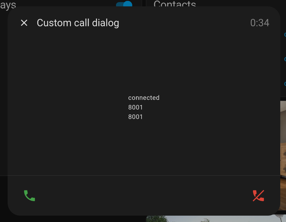
<span>Custom call dialog</span>
<span style="color: gray;">${this.sipCore.callDuration}</span>
</div>
</ha-dialog-header>
<div tabindex="-1" dialogInitialFocus>
<div class="content">
${this.sipCore.callState}
<br>
${this.sipCore.remoteName}
<br>
${this.sipCore.remoteExtension}
<br>
${this.config.test_value}
</div>
<div class="bottom-row">
<ha-icon-button
class="accept-button"
label="Answer call"
@click="${() => this.sipCore.answerCall()}">
<ha-icon .icon=${"mdi:phone"}></ha-icon>
</ha-icon-button>
<ha-icon-button
class="deny-button"
label="End call"
@click="${() => {
this.sipCore.endCall();
this.closePopup();
}}">
<ha-icon .icon=${"mdi:phone-off"}></ha-icon>
</ha-icon-button>
</div>
</div>
</ha-dialog>
`;
}
setupButton() {
const homeAssistant = document.getElementsByTagName("home-assistant")[0];
const panel = homeAssistant?.shadowRoot?.querySelector("home-assistant-main")
?.shadowRoot?.querySelector("ha-panel-lovelace");
if (panel === null) {
console.debug("panel not found!");
return;
}
const actionItems = panel?.shadowRoot?.querySelector("hui-root")?.shadowRoot?.querySelector(".action-items");
if (actionItems?.querySelector("#sipcore-call-button")) {
return;
}
const callButton = document.createElement("ha-icon-button");
callButton.label = "Open Call Popup";
const icon = document.createElement("ha-icon");
icon.style = "display: flex; align-items: center; justify-content: center;";
icon.icon = "mdi:phone";
callButton.slot = "actionItems";
callButton.id = "sipcore-call-button";
callButton.appendChild(icon);
callButton.addEventListener("click", () => {
this.open = true;
this.requestUpdate();
});
actionItems?.appendChild(callButton);
window.addEventListener("location-changed", () => {
console.debug("View changed, setting up button again...");
this.setupButton();
})
}
}
customElements.define("custom-call-dialog", SIPExampleDialog);
Step 2: Load the Popup in Home Assistant
To import this card into Home Assistant, copy the file to your config/www directory of your Home Assistant installation. Then, go to settings > dashboards, click on the three dots in the top right corner, and select "Resources". Click on "Add Resource" and enter the path to your popup file, like /local/sip-example-popup.js.
Make sure to set the resource type to "JavaScript Module", and then click "Create".
Step 3: Configure SIP Core to Use the Popup Element
To use your custom popup, you need to configure SIP Core to recognize it. Open your sip-config.json file and set the following configuration:
{
    "popup_override_component": "custom-call-dialog",
    "popup_config": {
        "test_value": "This is a test value"
    },
    ... rest of your configuration ...
}
This tells SIP Core to use your custom popup component instead of the default one.
Also, SIP Core tries to put the popup_config object in your component config property, so you can access it in your popup. In this example, we added a test_value property to demonstrate how to use it.
Now after saving the configuration and reloading with Ctrl + Shift + R, you should be able to see your custom popup in action when you click on the call button in the toolbar or when a call is received.
If it is not working for you, check the browser console (F12) for any errors, and make sure it reloaded correctly. You can also try reloading the page with Ctrl + Shift + R to force a full reload of HA.
To share your popup with others, you can upload it to a Github repository and use HACS to make it available for others to install and update easily.
And please share your popup in our Discord server or on the Home Assistant Forum. Would love to see your creations!